Admin Styling: every control
All 12 themes and all 13 colour controls are Free in 1.7.2. Earlier 1.6.1 wording that treated individual colours as paid is obsolete.
Theme palettes — Free and Pro
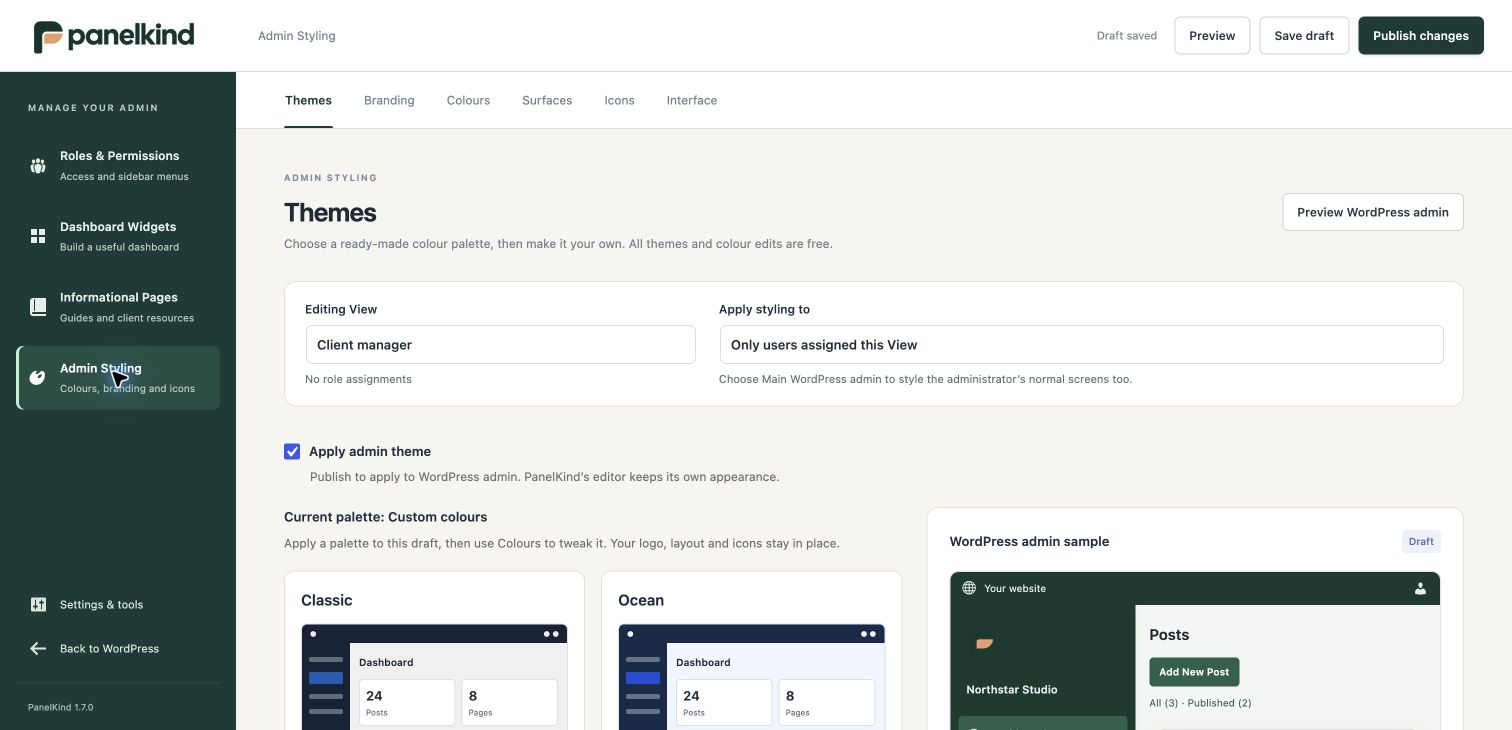
Classic, Ocean, Forest, Lagoon, Violet, Rose, Crimson, Ember, Honey, Sand, Olive and Graphite are built in. Apply a palette to copy its thirteen colours into the draft and enable Apply admin theme. Fine-tune in Colours; a modified palette is labelled Custom colours. Changes become live on publication.
Palette application preserves branding, icons and layout. If Free has stale unpublished Pro surface changes, applying a theme restores those inadmissible changes to the published values so saving can proceed; published custom surfaces and deliberate resets remain intact. If the View has no audience and no site-wide style source is selected, an editor with settings permission can have main-admin scope selected automatically. An explicitly chosen View-only scope is respected. Undo restores the preceding palette, theme switch, repaired surfaces and automatically changed scope.
Control inventory
| Tab / setting | Availability | Values or behaviour |
|---|---|---|
| Apply admin theme | Both | On/off for the full admin theme |
| Style scope | Both | Main WordPress admin — all users, or only users assigned this View; global choice requires settings permission |
| Workspace name | Both | Up to 100 characters |
| Logo | Both | Media-library selection or validated image URL; image file remains separately hosted |
| Logo width | Both | 40–240 px; default 140 |
| Sidebar logo | Both | Show logo in the sidebar |
| Custom footer text | Pro | Up to 300 characters |
| Hide PanelKind credit | Pro | Removes the client-footer credit |
| Accent / accent text | Both | Primary action/link colour and text on accent |
| Background / surface | Both | Page background and card/table surface |
| Text / muted text | Both | Main and secondary text |
| Border | Both | Borders |
| Sidebar background / text | Both | Default sidebar colours |
| Sidebar active / active text | Both | Active menu item colours |
| Toolbar background / text | Both | Admin toolbar colours |
| Card corners | Pro custom values | 0–24 px; standard 9 px |
| Button/menu corners | Pro custom values | 0–24 px; standard 4 px |
| Card / sidebar shadows | Pro custom values | None, soft, medium, strong; standard none |
| Dashboard density | Both | Compact or comfortable |
| Sidebar width | Both | 160–260 px; default 180 |
| Icons | Both | Valid WordPress Dashicons for native menus, shortcuts and section items; shared with Sidebar & View |
| Interface cleanup | Both | Welcome panel, Help, Screen Options and selected toolbar items |
Colours are validated hex tokens. There is a live sample and contrast feedback. The editor does not accept arbitrary CSS, arbitrary shadow values or uploaded custom icon sets through these controls.
Where styles apply
Main-admin scope supplies presentation to standard WordPress screens including owner screens, without assigning a View or changing access. Owners retain native navigation. View-only scope follows that View's assignments. The PanelKind editor and recovery mode remain outside the theme. For Full administration, custom branding/layout requires the theme switch; Free edits the client View as its style source rather than modifying the fallback itself.
Other client View branding, icons and cleanup can operate independently of the full theme. With the theme off, the legacy accent still colours client-dashboard links. Turning the theme off does not permit saving new Pro surface values on Free.
Third-party interfaces that supply their own styles may need compatibility work. The block editor's content canvas is not themed. Published Pro surfaces survive downgrade; Free can keep them while editing colours or reset the four surface fields to defaults. Once the reset is published, restoring those paid values needs Pro.